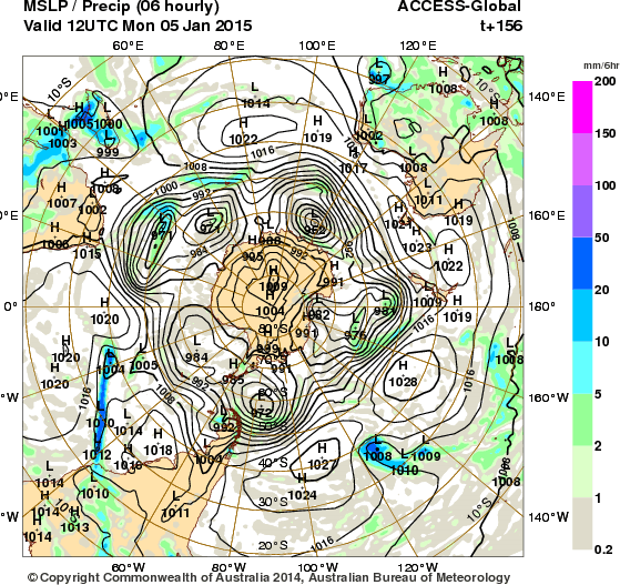
The charts from Australia become acneyed in this run:


Yes, I know we don’t spell acne-ed that way but I was not spelling acne-ed.
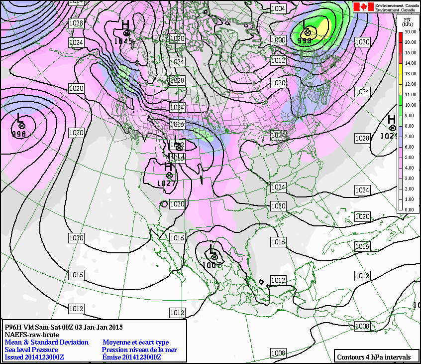
What I believe to be happening to cause this causes a generally useless state of affairs with the NA-EFS chart too:


Sorry about the why that these are displayed. Generally the high colour charts are the farthest off and thus last to appear on the web. There is a problem with my OS I don’t know how to fix, nor want to bother with curing.
What you are looking at in the last two charts are the first two forecasts. You can see a large complex Low in the region of the Great Lakes. (Isn’t Great Lakes a typically American name for geography? Bloody yanks think they own the whole world. You own just a large part of it, anybody can do that -even the bloody English did that; Damnit!) This is both a relation of tornadoes and a precursor to volcanic activity Popocatépetl not withstanding.
The North Atlantic looks more or less as it has looked for the last few days:


I am not sure what order these are in, the best thing for me to do is for you to download them yourself if they upset you that much, you lazy sod!
Now you have made me forget what else I was going to say. Good job this is my website so that I can come back and edit it when I remember.
What I also forgot was that the following make the butterflies normally seen in singularities look monochromatic. Here is a “dual” (think Rorschach inkblots) an no I don’t know what a dual is some sort of a toroidal spiral perhaps?


What I do know about the above is that the stuff on the western side of the Pacific is going the wrong way. Also the North Atlantic has a tornadic front signal in it that is not going to go through a pair of anticyclones (about which I have written a few times, if not extensively.) I may be inveigled to describe the activity again -if only because I like the word inveigled. But for now, I am going to bed (which is where I do my best work, despite what the bible cautions on that.)

